Cover art is sometimes (very often) maligned in our genre. (We even discussed the many naked chests at GRNW 2013, which led to one of our favorite lines spoken at the conference–Lou Harper’s “In defense of the headless torso…”)
The truth is that the genre boasts a lot of fantastic cover artists, who have a tough role of capturing the reader’s eye and capturing the story’s essence, all in one small space.
One of the features for the GRNW blog will be to go out and talk with those amazing artists and find out more about the magic behind their process.
For our first Cover Art Expose, we talk with the wonderful Jordan Castillo Price, who not only self-publishes her work through JCP Books, but does all her own cover art!
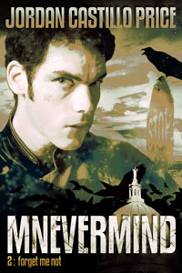
At the end of this interview, we’ll also be doing a giveaway for JCP’s sci-fi novel Mnevermind 1: The Persistence of Memory.
 1- What was the first book cover that you worked on?
At the time, I didn’t realize how rare this was, but I made a request and Torquere Press allowed me to design the cover to PsyCop: Partners, the print compilation of the first two PsyCop novels. In 2006 m/m was pretty new and I imagine a lot of the standard practices in place now were not established yet. Nowadays it would be quite rare to be allowed to design your own cover. Many publishers don’t even give their authors the right of veto, citing “house style” over the preferences of the author.
2- How long does a cover normally take? Which cover of yours took the longest (and why?)
I’d say I work on each cover about half a week to a week. Initially it’s getting all the elements in place. If they don’t work correctly, this is the point I go back to the drawing board. Sometimes things look fantastic in my head but they’re too busy or confusing on the page. The last few sessions I’ll spend cleaning up and tweaking, putting on finishing touches. Then I sleep on it and end up tweaking a few hours more.
My covers for the Petit Morts series took the longest because they’re vector art. Instead of colored pixels, they’re composed of mathematical points and curves. Theoretically you could zoom in infinitely and all the lines would still be crisp, unlike regular pixel-based artwork where it turns into little squares when you zoom or enlarge. It’s a more labor-intensive process but I wanted the bold graphic look that’s unique to vector art…well, I imagine you could mimic it with a pixel-based program but I was comfortable enough working in vectors. I’m a heck of a lot rustier nowadays. The last vector element I designed was the Spook Squad logo and FPMP seal on the back cover of the paperback.

The Petit Morts series
3- For the art nerds out there, what are your preferred tools and programs?
For paperback and PDF typesetting I use InDesign. For cover art, mainly Photoshop, though for vector work I prefer Illustrator. Photoshop has vector tools now, which is new-ish these past few years. I’m just more accustomed to Illustrator, which I used quite a lot in my day job for flyers and big signage (like the type of banner you’d see hanging from an overpass, for instance.) I was a graphic designer at a public library for many years, so I got to learn how to do things from postcards to bookmarks to those big ol’ overpass signs.
For any major art nerds who might wonder, I’m running CS6, though undoubtedly some new feature will come along and tempt me into upgrading to Creative Cloud. I try to train at least an hour a week through something like Photoshop User TV, or Lynda.com, or Kelby Training, or my local Adobe User Group, and inevitably I’m going to see something that’ll make me want to upgrade since these trainings tend to focus on the latest version. New Camera RAW integration looks really nice, for example.
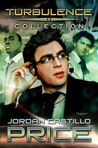 4- You’ve done a lot of series covers, with your Psycop books, Channeling Morpheus, Petit Morts, and the different chapters in the Turbulence serial.
What is it like when you’re tackling covers in a series? And how did your style differ between these series?
It seems like I must have realized a series should have a cohesive look—it’s just a matter of common sense—but PsyCop evolved over so many years in such a piecemeal way that it really didn’t have a particular “look” beyond the PsyCop logo. Certainly my skills improved a lot since 2006 as well. Since I’m now the publisher, I’m opting to redesign PsyCop so that it looks like an actual series. That project began last year. I’m working on Camp Hell (book 5) now.
 Sometimes a cover “look” will be dictated by choices the stock photographer made. Because the photographer added B&W high-contrast effects to the shot of Michael on the cover of Payback (Channeling Morpheus 1), if I wanted to use that shot, I needed to make all the subsequent cover art match it. (And I was really married to that shot.) For that series, I think it worked really well, but in general it irks me when stock photographers make artistic choices like B&W effects, or really close cropping. A lot of shots are unusable because half of someone’s head is cropped away, for instance, so I can’t position them where I need to in my composition. And if I want B&W, I can make my own B&W since I have filters too…and maybe I would have chosen a different sort of contrast than the photographer picked. /rant
5- You have a knack for finding excellent cover models for your books. (GRNW hearts Wild Bill!) How hard is that search process?

GRNW hearts Wild Bill
Thank you! I heart Wild Bill too…wow, that mouth. Searching through stock models is actually kind of nauseating for me, I’m not really sure why. I must be looking too hard at the monitor for too many hours.
I will hoard good photos for years and years. I’ve been holding onto the cover model for Elijah from Mnevermind forever. I had nicknamed him Major Tom because he had a late 80’s New Wave look to him and he reminded me of the Peter Schilling song.
Some stock photos are pricier than others. I’m willing to pay for really expensive photos if need be because I’m self-publishing now and I can make that decision to invest, whereas authors working with publishers are usually limited to a smaller pool of more affordable art. Wild Bill was expensive, but oh so worth it.
I live in fear of putting a model on my cover and realizing he’s prominent on someone else’s book. It’s deplorable how few stock photos of men are available as opposed to women.
6- What cover was most challenging for you and why?
I was going to put Captain Kaye on one of the Turbulence covers, but older women are even more underrepresented than men. After hours of searching I found one model I liked…but the photographer had cropped her so close that I couldn’t position her anywhere on the page, and eventually I gave up.
 7- Is there a cover that you wish you could go back and redo?
Absolutely, I’d do Body Art in a second. I think I was so excited to see that tattooed arm reaching to adjust a tie (it represents a theme in the book so well) that I didn’t consider the overall tone of the cover. In a re-do, I’d forget about presenting a visual narrative a certain scene and make it look more like a thriller. And I’d have lots of dark tree silhouettes. I also have a theory that the eyes are the most important part of the model (which is why I despise those naked manchest floating over cityscape covers in m/m) so I might dig around and find a good headshot to represent my main character.
8- Are there things that you hadn’t thought about before you started doing your own book covers?
Ebooks are changing fast. To give you some perspective, when I started making ebook cover art in 2007, the Kindle wouldn’t be on the horizon for over two more years. I guess I would have thought there’d be a standard electronic art size, but there really isn’t. Various devices have different resolutions as well as different ratios, kind of like all the different computer monitor sizes. I just go with a ratio of 2:3 now and it seems about as “standard” as you’ll get.
This is a bit of a non-sequitur, or maybe it’s related, but one thing I used Photoshop for as a graphic designer at a public library was to take nonstandard audiobook packaging, scan it, manipulate it into a standard ratio, and make it work with a package we could circulate. So I went to pick up a CD-set on hold today and wondered why it looked so familiar—had I listened to it? Then I saw it was from my old library and realized that I’d re-done the packaging myself a few years ago. Ha!
9- Do you have any recommendations you can share for those who are thinking about doing their own book covers?
 Get really good at Photoshop and don’t waste your time with freeware programs. Buy an older version of Photoshop if money is an issue, just check the system requirements to make sure you can run it. It makes me crazy in certain publishing forums where new publishers are trying to figure out how to publish a paperback using freeware or Microsoft Word. I’m probably an Adobe snob, but it bugs me when people attempt to force consumer tools to do professional jobs and then wonder why it doesn’t work. Adobe software is a monetary and time investment, but it’s the industry standard.
If you’re totally new to Photoshop, grab a free one-week trial membership at Lynda.com and watch some intro courses for a solid week. I personally think the annual subscription there is worth much more than they charge. Photoshop is a very in-depth program, you’re not going to learn it in an afternoon. I’ve been learning since 1999, and as I said, I try to do an hour of continuing ed each week. If online learning isn’t your thing, invest in a class through your community college.
Once you have the hang of Photoshop, look at images you really like and try to reproduce them. I don’t care for most book covers so I look at movie posters instead. There are often multiple ways to get the same effect in Photoshop so tinkering will usually get you somewhere.
If you’re an author and the art is for your own books, be aware that publishers generally don’t let you do your own cover art.
 10- Any future covers on the horizon you can tell us about?
I mentioned the star of my latest cover earlier: Elijah from Mnevermind (otherwise known as Major Tom, who I’ve been hoarding for at least five years). Book 2 of the trilogy, Forget Me Not, will be out later this month. I really enjoyed working on the covers for this series, both the photographic effects and the logo with the crows and the state capitol behind it. Their dreamy, intense and stylized tone really reflects the nature of the stories, a very gritty and realistic speculative fiction about false memories. The interiors of the paperbacks were also fun to lay out, where I used some subtle crow graphics on the pages.
Thanks so much for the interest in my cover art! Hopefully I didn’t send anyone into a design-geek coma!
Thanks, JCP! And for anyone interested, you can download a free PDF of JCP’s cover art gallery!
Giveaway Time!
To celebrate Mnevermind 2: Forget Me Not coming out later this month, we’re doing a ebook giveaway of Mnevermind 1: The Persistence of Memory to one commenter below. We’ll pick a winner on Sunday. Good luck!! 😀

 In 2013, Less Than Three Press started releasing audiobooks, with the fantasy novel Prisoner being the first release. We wanted to ask them about the process and what they learned during it. We talked with Megan Derr and the Less than Three crew about what the audiobook process was like for them.
 Were there any challenges that you faced during the process that you hadn’t known about before making audio books?
 Authors – make sure your contracts give you plenty of say in the matter. You don’t want to sign over all the audio rights and then find out well after the fact that your book was put in audio and you completely hate the voice actor and they say half the names wrong. If your publisher doesn’t do audiobooks but you’d like that to be an option for your readers, make sure you retain those rights.
 Less Than Three contributes to the Overdrive Library, which is the resource for ebooks and digital materials for public libraries across the U.S. Do audiobooks go into the Overdrive system as well?